First Things First Manifesto & Design Research
- Apr 14, 2022
- 4 min read
Updated: Apr 6, 2023

First Things First Manifesto
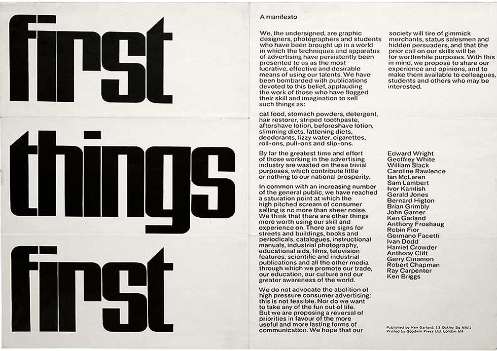
The original First Things First manifesto was written in 1963, published in 1964, by Ken Garland and signed by an additional 21 ‘visual communicators’. It called upon designers to consider their influence and examine alternate uses for their talents as opposed to working tirelessly promoting consumerism.
2000 Edition
35 years later, the second version, the First Things First 2000 manifesto launched by Adbusters magazine in 1999 and signed by 33 designers including Jonathan Barnbrook, Irma Boom and Milton Glaser. It was an updated version written by Adbusters with input from other interested parties. First Thing First 2000 manifesto was conceived from the outset as an international initiative, and it was launched simultaneously in Adbusters, AIGA Journal and Emigre Items in the Netherlands. The 2000 version had a similar structure to the original while broadening its target from advertising to marketing and brand development. Its language and argument brandish the fiery worldview Adbusters had spent a decade cultivating. By their actions, designers were supporting “a mental environment so saturated with commercial messages that are changing the way citizen-consumers speak, think, feel, respond and interact.” Graphic design had helped to construct “a reductive and immeasurably harmful code of public discourse.” Consumerism was “running uncontested” and designers should help to challenge it.
2014 Edition
In keeping with its aims and the society changes, Cole Peters, a Canadian-born designer based in the UK, has updated the manifesto for 2014, aiming to reflect the influence of the Internet on communications and design. He decided to update the manifesto because the widespread technology in that day and age, particularly the Web, has come about as a result of the democratization which neither of the previous manifestos addressed. He felt the message should be brought up-to-date with contemporary concerns; 2014 being the original manifesto's 50th anniversary made the timing even more meaningful. He also opened it up to any signatories. Anyone in sympathy with the manifesto's imperatives could sign and more than 1600 people seized the opportunity. As before, the text follows Garland's structure and some of his original phrasing, including his wish "not to take the fun out of life."
2020 Edition

The first American version, the First Things First 2020 manifesto was published online, and updated by Namita Dharia and Ben Gaydos. It blasts the reader with these issues: "Our time and energy are increasingly used to manufacture demand, to exploit populations, to extract resources, to fill landfills, to pollute the air, to promote colonization, and to propel our planet's sixth mass extinction." The manifesto consists of a checklist of design goals, covering the histories of ethics of design, community-based initiatives, non-exploitative social relations, nature as a complex system, and reconnecting design and manufacturing to the Earth and its people.
“Climate change and racial justice work are often represented as two different concerns, but in fact they are interlinked issues due to their roots in capitalism,”
What I've Learned From it?
The aim of the First Things First manifesto was to awaken the design community to reflect on the dispensable ideas targeted at serving advertisers and corporations' greed rather than society's needs. The updated versions address more problems as society changes.
For example, the manifesto was conceived from the outset as an international initiative in the 2000 edition, broadening its target from advertising to marketing and brand development. In the 2014 edition, the manifesto addressed the new ways in which those with skills in the fields of design and technology are spending too much time working on superficial problems. the manifesto also stated that the industry prioritizes profit over usefulness and isn't particularly focused on solving real problems around education, medicine, privacy, public awareness and other important areas. In the 2020 edition, the manifesto highlight more about the histories of ethics of design, community-based initiatives, non-exploitative social relations, nature as a complex system, and reconnecting design and manufacturing to the Earth and its people.
Through the evolution and the aim of the First Things First manifestos, I can see how the design industry evolves, how many designers work tirelessly to promote consumerism without any passion, how designers can cause serious social problems, and how designers can cause climate problems. The goal was to decentralize the process and open it up to anyone related to the industry.
Design Research
A design that lacks research support will only be an element of aesthetics. The foundation of every design project starts from doing research. As things move forward and change day by day, it is crucial to do some research before executing any design. Modern graphic designers are embracing research and integrating it into their process. It helps to question their intuition, affirming it and validating their work. Design decisions are also based on data, findings or insights. Research can also help the designer to understand deeper about the topic, especially if the topic is regarding a particular location or culture (Vernacular).
Research Framework:
Objective (rationale, solve the problem, investigate a topic, narrow down the topic)
Questions (hypothesis)
Methodologies (qualitative & quantitative)
Data Collection (primary & secondary resources)
Conclusion
+ Visual Communication
Always involve the target audience's perspective as we are designing for them, how to gain their attraction, to make awareness, to make them related to the design via design psychology studies, etc. Besides, as a designer, we should always have the ability to question things, question our own practice, reflect on it and understand why we do and what we did. It can help us explain it to people clearly.
Reflection on Past Project


The brief was to change an ad with a misleading title or graphics to a proper one. As the picture and attached file shown, I've chosen Nivea's "White Is Purity" campaign. The objective is to show Nivea's invisible deodorant that doesn't leave any stain on white clothes. I came out of the idea as the reference, having a white cotton shirt represented as a plate while having a mustard sauce on top, to highlight the function of Nivea's invisible deodorant.
The visuals can be misleading as a laundry detergent as it is the main reference of the visuals. This is because lack of further research to support the visuals and the absence of any data, finding or insights. The colour theme applied in the poster doesn't have a relation to the main objective of the campaign which is "Purity".
References:


Comments