Understanding Grid Systems
- May 14, 2022
- 4 min read
Updated: Apr 6, 2023
InDesign Workshop #1 - Kern Kamp
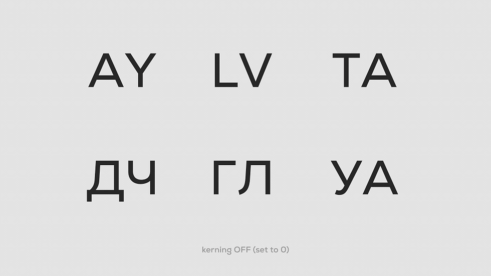

Kerning
Kerning is the adjustment of spaces in between individual letters. If the letters are too close or too far apart, they are harder to read. An uneven spacing, on the other hand, results in a poorly design work.
Kerning is all about rhythm. If letters are not kerned correctly, it can put off the reader and disrupt the message.

Tracking
Tracking is the spacing throughout the word/s, also referred to as letterspacing. Typically, it is done when you need to fill in a space that may be wider or smaller. Consider it as the area for which you need to fit your word or words in. If you have a wider area and short word, your letters will have to be wider or you might need to space the letters far apart. On the other hand, if you have a smaller area and longer word, your letters will have to be narrow and closer in terms of spacing.
Tracking changes the space between every letter in a word/paragraph at the same time. It can be used to change the density and structure of a word or paragraph.

Leading
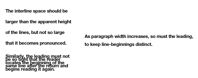
Leading is the space in between baselines, like in a paragraph. When you have multiple lines of texts, you need to check how you would place the lines apart. Spacing them too close or too far may affect the legibility.
How I memorize it
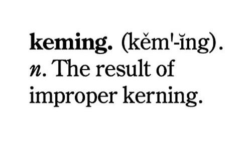
Kerning: Keming — The result of improper kerning

Tracking: Typography Tracks — Train tracks in typography
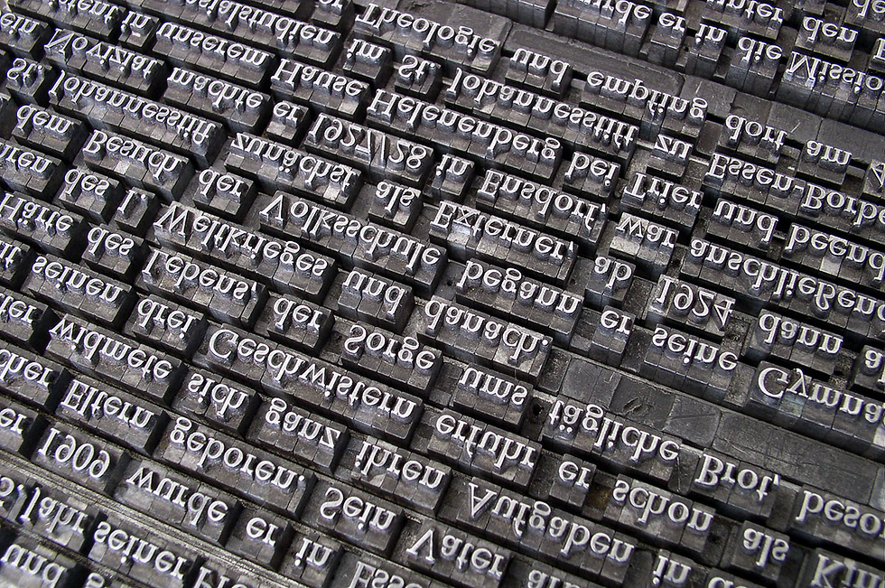
Leading: Lead — Terminology and Principles of Typesetting by hand
InDesign Workshop #2 - Leading By Example + Typography & Layout


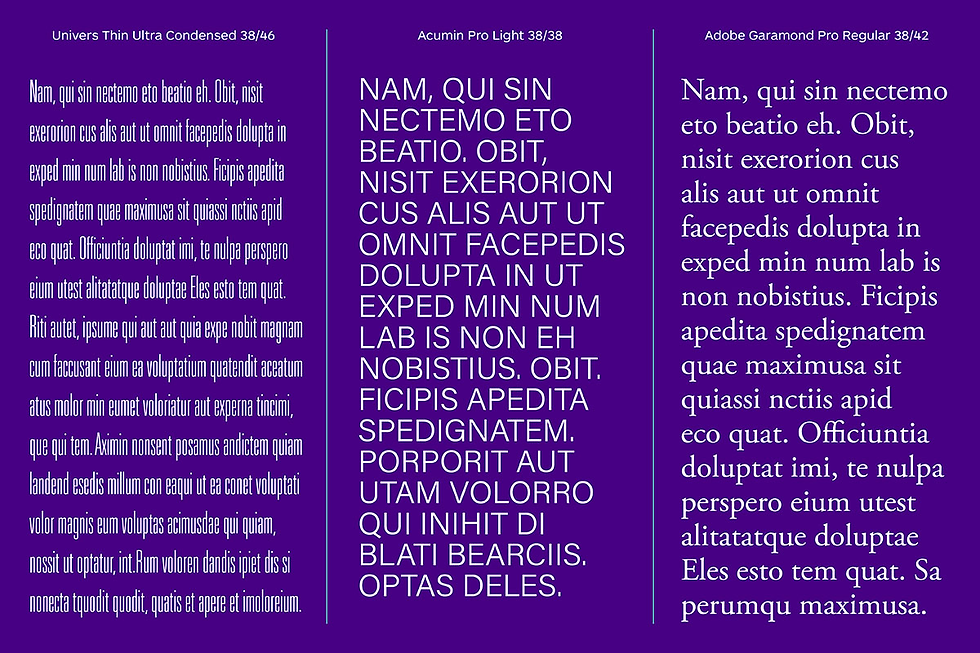
The leading choices can depend on a variety of factors, starting with the aesthetic of the typeface itself, usually determined by the typefaces' x-height or their ascenders and descenders.
X-height
Every typeface is created based on its own set of aesthetic rules and principles. The x-height of each typeface will vary—sometimes it is a minor variation in size, but sometimes the range of dimensions is quite extreme, especially when you’re comparing a narrow condensed typeface to one that’s more suitable for the body copy sizes. The x-height of each individual typeface is one of the factors that affect leading.
Ascenders & Descenders
These are elements that extend above and below the x-height, respectively. Depending on the design of the typeface, they can be very subtle or overly exaggerated—a good example of the latter would be a script typeface with flourishes and swashes. The appearance of ascenders and descenders, combined with the typeface’s x-height, can drastically affect the leading dimensions.
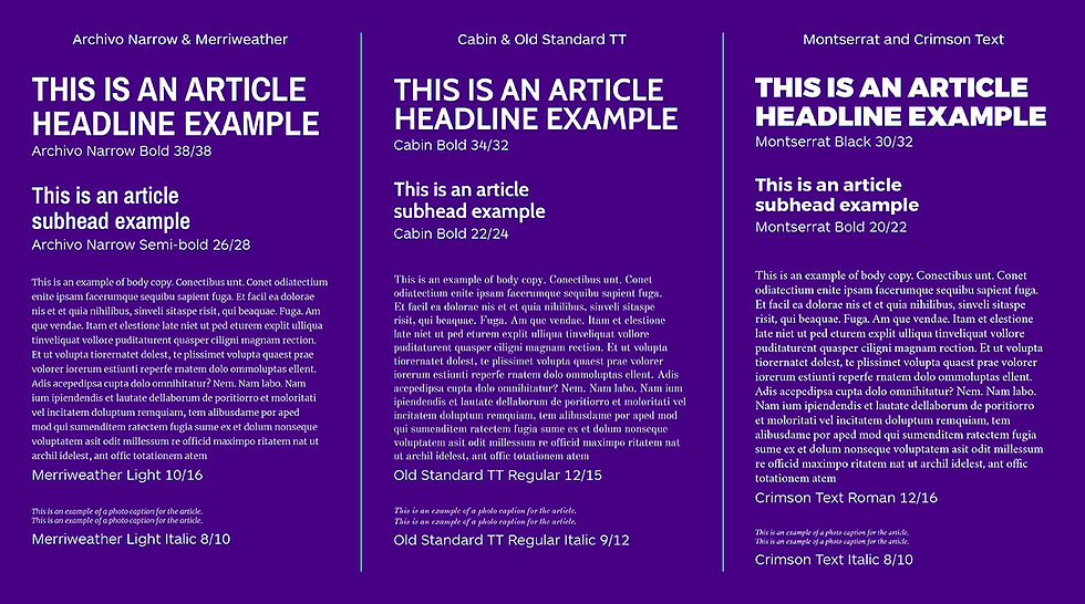
Type studies compare options that could be suitable for your project, as well as determine appropriate weights for different applications, point sizes, and leading sizes.
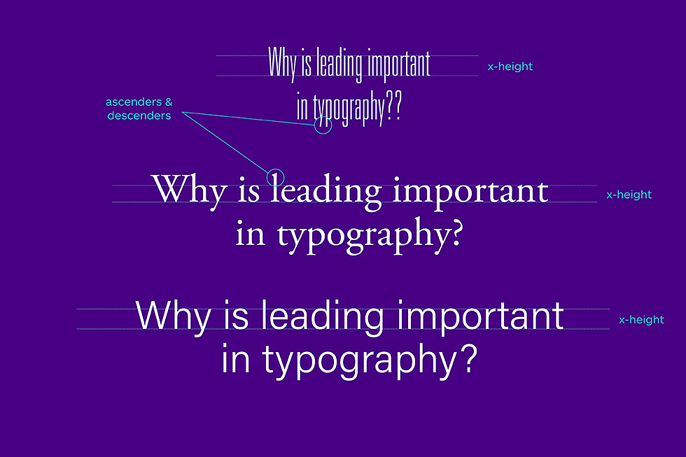
Over positive leading makes each line seem off or separated from the other, with too much room to breathe; over negative leading makes the paragraph illegible, with less room to breathe. Perfect leading makes the text easier to read while maintaining its direction.
InDesign Workshop #3 - Grids
Making the Grid
All design work involves problem-solving on both visual and organizational levels. Pictures and symbols, fields of text, headlines, tabular data: all these pieces must come together to communicate as a totality. A grid is one approach to doing so.
Before anything else, a grid introduces systematic order to a layout.
Not only does it distinguish different types of information, easing a user's navigation through them but—just as importantly—it ensures vital cohesion among visual elements, harmonizing them through the systems of spatial proportions and positioning logic it defines.
Grid Basics
A grid consists of a distinct set of alignment-based relationships that serves as a guide for distributing elements across a format: where they may be placed; their height-to-width proportions; and, ultimately, the ease with which a viewer can navigate the layout.

Although grids may seem overly mathematical, the notion of this structural approach grows quite organically from the nature of typographic form.

Within the format, alignments between elements create structure. In these compositions, space is divided based on content:
Like information is grouped together, Disparate information is separated; Their resulting widths and heights subdivide the surrounding field.
Changes in weight and scale introduce hierarchy—visual ordering—to the information.
Typographic space is governed by the part-to-whole relationships that alignments define but, more importantly, by the relation of positive and negative they create.
Type of Grids
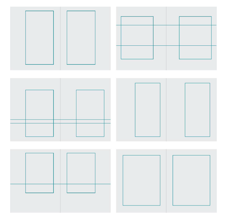
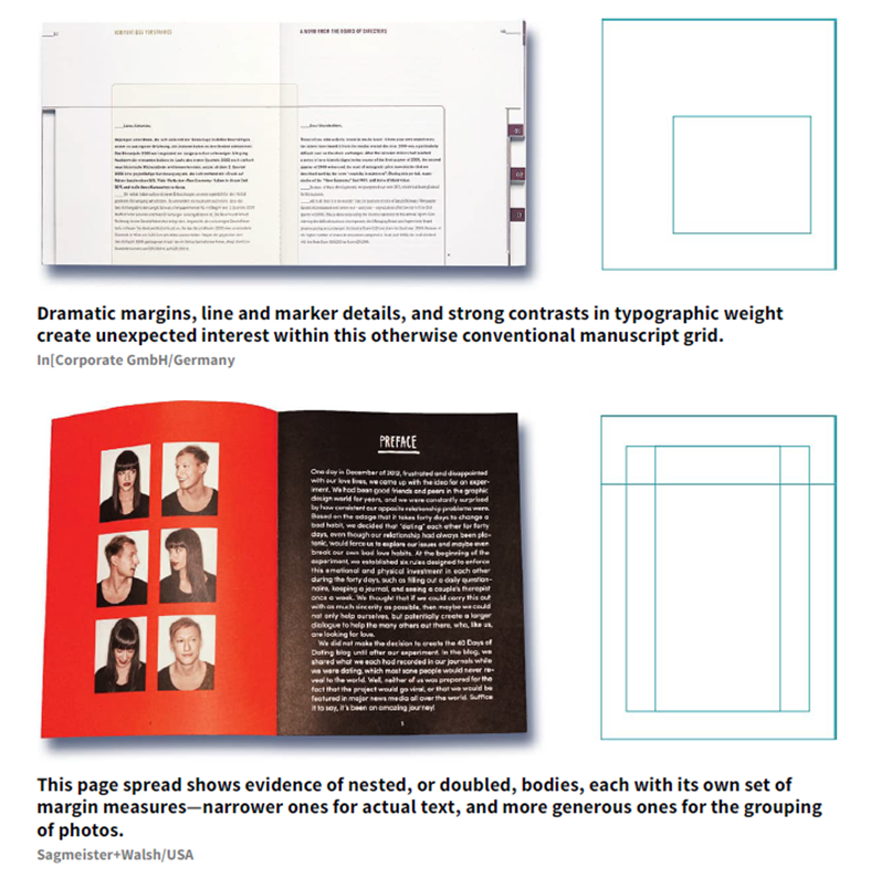
Manuscript Grid
The block, or manuscript, grid is structurally the simplest kind of grid: It consists of a single, relatively large text block on each page of a spread, and its purpose is to accommodate extensive continuous text, like a book or long essay.

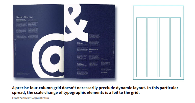
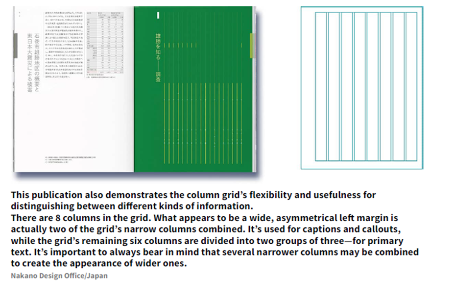
Column Grid
Information that is discontinuous benefits from being organized into a grid of multiple columns. Because columns can be dependent on each other for running text, independent for small blocks of text, or crossed over to make wider columns, the column grid is very flexible and can be used to separate different kinds of information.


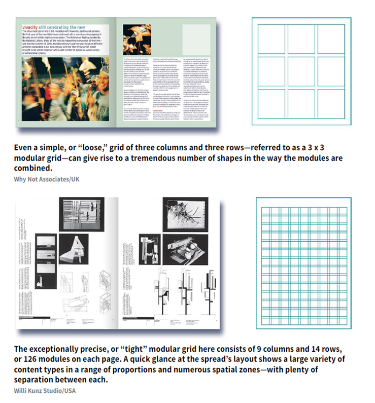
Modular Grid
For extremely complex projects involving many different kinds of information, a modular grid may be the most useful choice. A modular grid is a column grid with a large number of horizontal flowlines that subdivide the columns into rows, creating a matrix of cells called modules.


Hierarchic Grid
Sometimes the visual and informational needs of a project require an odd grid that doesn't fit into any category. These grids—called hierarchic grids—conform to the needs of the information they organize, but they are based more on an intuitive placement of alignments customized to the various proportions of the elements, rather than on regular repeated intervals.


Compound Grid
Sometimes—to address content issues or to achieve a desired look—a designer might use multiple grids in the same project, either between sections or even within a single page spread. Each grid can be assigned a particular kind of content to organize, or material can be articulated across divisions within the multiple grids.


InDesign Workshop #4 - Shaping the Page
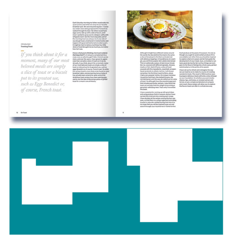
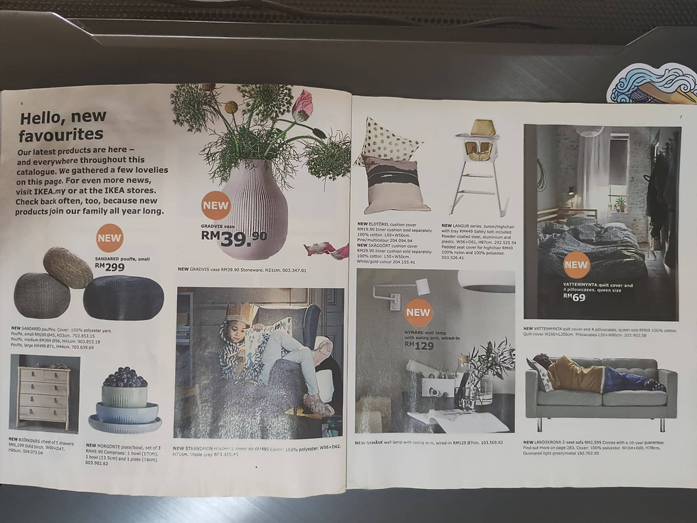
For this activity, I've picked an IKEA magazine for tracing the grid layout

The following page is the page that I'm gonna trace
Because the dimension of the magazine is square while my tracing paper is A4, I can't manage to trace some of the parts that the tracing paper is not covered.
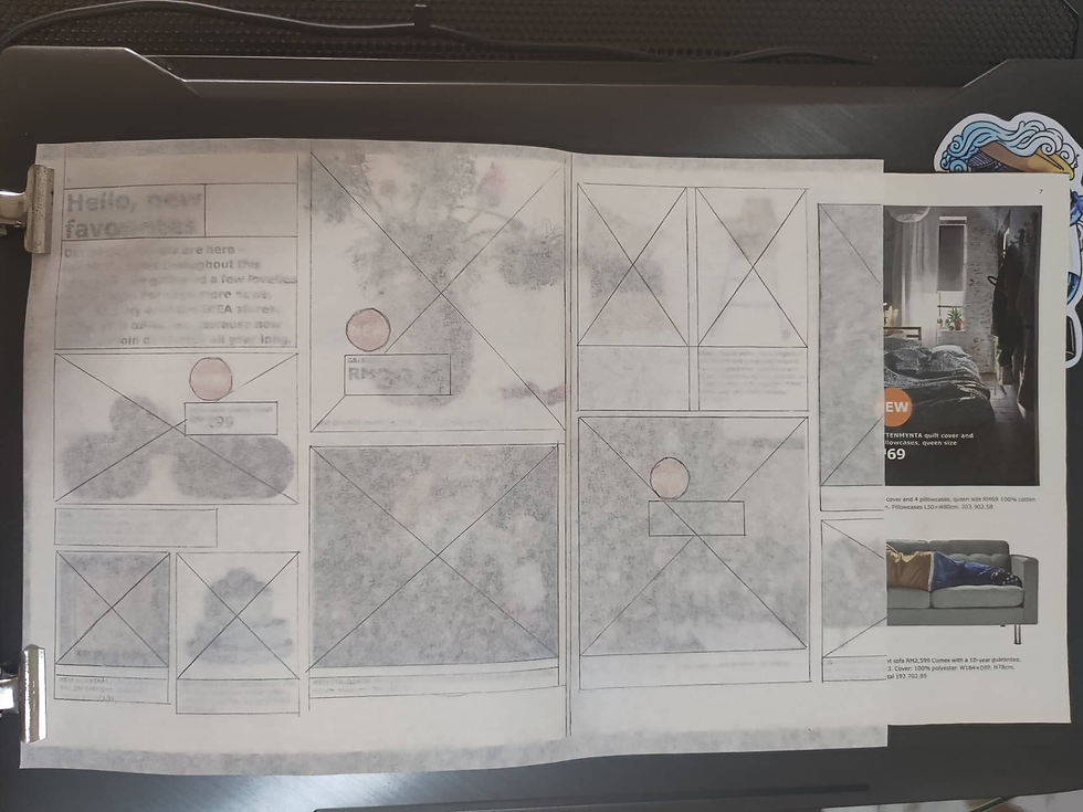
This is the result I got, it's a column grid.

A few possible layouts from the grid I have. I've included the part that I didn't manage to trace in it.

References:


Comments