Think Back & Reflect
- Apr 29, 2022
- 6 min read
Updated: Apr 6, 2023

Thoughts and Perspective of Graphic Design
Back in the days when I haven't join Diploma in Graphic Design, I perceive graphic design as a profession which creates visual content to communicate messages, a job that helps to translate clients' contexts into a visual form or has a unique style to gain exposure and reputation. After graduating with Diploma, I perceive graphic design as more than a profession which not only creates visual content to communicate messages, it creates a form of purpose, a solution or an emphasis on something rather than plain aesthetics which does not have any context with it.
Right after joining my degree, I learned that graphic design can be categorized into four fields. According to Four Fields of Design by Tharp and Tharp, graphic design can be into four fields such as commercial design, discursive design, experimental design and responsible design. Each field of design serves a different purpose based on the intent of a designer. It can be oriented or driven by the market to generate adequate profit, communicate ideas or raise awareness, motivated by curiosity to do further experimentation, or driven by a more humanitarian notion of service.
Despite the general definition given for graphic design is—the art and profession of selecting and arranging visual elements such as typography, images, symbols, and colours which serve the purpose to convey a message to an audience. Sometimes graphic design is called “visual communications,” a term that emphasizes its function of giving form—that is the similarities that I considered graphic design is initially, just like the ice tip of the iceberg. But as I've furthered my studies, a deep dive into graphic design, is more than what it really is, just like discovering the whole iceberg.
Mapping Practice

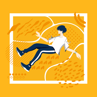


I've shown three of my previous projects image to a friend that I meet when I joined the degree course. I didn't provide any context about the projects and asked her to plot them to the categories according to Four Fields of Design by Tharp and Tharp, the results are shown in the following:

Yellow refers to Image 1, Blue refers to Image 2, and Pink refers to Image 3
She got two correct, which are yellow and pink. She mentioned that by Image 2, she can't tell what is the poster referring to. I gave her a hint that the poster is refer to something that is a health-related topic. She later plotted the project is categorize it in Responsible Design.
Just a quick description of each project and where it should be categorized. Project 1 (Image 1), titled "Explore, Experiment, Enhance", is a manifestation of my passion for design and my design process which defines the versatility of my design applied for different purposes. . Project 2 (Image 2), titled "AB-NORMAL", is an awareness campaign for Obsessive-Compulsory Disorder (OCD) which clear the misconception and myth of OCD. Project 3 (Image 3), titled "Resonance", is a combination of packaging and branding projects, the branding inspires by the etiquette of gift-giving traditional culture in China which brings resonance to one another; the packaging inspires by the 3 main types of happiness which are pleasure, passion and purpose. Those projects should be categorized as Experimental Design, Discursive Design and Commercial Design accordingly.
Given the feedback from the respondent, Project 2 is somehow misleading and the design didn't bring its context to the viewer. I'm quite surprised that the design was not impactful enough to make the viewer relate to the topic immediately. I've shown my other friends and family back then when I was doing this project and it didn't seem off to them. However, there is still room of improvement in this project because the given time frame to create this project was too short back then.
I Am Here. Who Are You?
I Am Here

Who are You?
As graphic designers we should to be able to communicate clearly what we do. As a way
of declaring your interests and generating your own agenda for the year ahead, consider
the questions below and provide answers for each of them.
1. What sort of designer are you and do you want to become?
I consider myself a graphic designer who is more exposed to the advertising, branding and marketing fields. I aim to be a UI/UX designer primarily.
2. What ideas are you interested in and why?
Conceptual and experimental design ideas. It is fascinating to see how other artists translate a specific feeling, an experience, or any psychological, sociological, and ideological related topic with visuals. I'm always curious about what is the meaning or story behind it, why they apply a specific design or art style to it, why are the design elements being used and other things which trigger my curiosity to know more about it.
3. What media/approaches do you use/want to use and why?
To name a few, Facebook, Instagram, Twitter, YouTube, pixiv, Tumblr, Pinterest, DeviantArt, ArtStation, Behance and Dribble. Mostly to gain motivation, inspiration and ideas through these media. Besides, to study more about it through its context, design language, behind the scene and story of a specific project.
4. Which designers provide a context or inspiration for the type of work you want to do?


Left - Leyland James Kirby; Right - Ivan Seal
a. The Caretaker & Ivan Seal - Everywhere at the End of Time
The Caretaker is a long-running project by English ambient musician Leyland James Kirby. His work as the Caretaker is characterized as exploring memory and its gradual deterioration, nostalgia, and melancholia. His latest album, “Everywhere at the End of Time” is so much more than a collection of songs — it's a cinematic-like story of experiencing loss, struggling and deteriorating down to nothing. The whole album takes three years to develop with a constant exploration of old vinyl recordings and experiments to mix them together to portray the experience of dementia. The album was segregated into six different phases, portrays different stages in dementia.
On the other hand, Ivan Seal makes paintings viewed as individual parts to a larger ongoing archive. Documenting imagined objects from memory and its unavoidable errors, the archive acts as document to nonsense and ones' wandering mind. Improvisation and free associative devices become systems to create an image. He collaborated with The Caretaker on a number of record covers. Paintings by Seal tend toward the uncanny, with a representational simplicity locked in a tense duel with a habit for seeming to always be silently thinking out loud. Together, their work in different mediums found a match. Fun fact, Ivan Seal studied at the Sheffield Hallam University.
 | Phase 1: Daydream | Art 1: The last of the great days |
 | Phase 2: Denial | Art 2: Refusal |
 | Phase 3: Reality | Art 3: Broken |
 | Phase 4: Rupture | Art 4: Confusion |
 | Phase 5: Horror | Art 5: Familiarity |
 | Phase 6: | Art 6: Nothing |
From my perspective, this is the all-time inspiration source for me personally. The album was initiated as an experimental project, letting the audience experience dementia through music. After the album was developed, it somehow raises dementia awareness in the public, donations were made to the related community and both artists received support based on their work.
b. Saul Bass
Saul Bass was famous for his use of simple, geometric shapes and symbolism. Often, a single dominant image stands alone to deliver a powerful message. These shapes, as well as type, were often hand-drawn by Bass to create a casual appearance, always packed with a sophisticated message. His ability to create such a powerful message with basic shapes makes the work even more impressive. The man is best known for his work in film.
He stepped up the sophistication of movie posters with his distinctive minimal style and he completely revolutionized the role of title credits in films. Besides, Saul Bass was also involved in logo design. He inspires me when it comes to simplicity, minimal yet impactful designs.
c. Marta Veludo
Marta Veludo is a multidisciplinary graphic designer and art director. Inspired by pop culture, folk art, pound shops and Tumblr and fascinated by inventions, colour, movement and compositions. She designs and conceptualises for both cultural and commercial fields. Whether in the digital realm or on a three-dimensional scale, she combines different disciplines and mediums to build engaging experiences. Her clients include Adidas, Reebok, LEGO and Vice. All her work gives me a sense of the creative life that she leads as a mixed-media artist, passing on her positive energy to a worldwide audience.

Reflection of My Works
Compared to the examples of this week's lessons and other projects that I've found after, I felt that the projects that I've done previously were more focused on skills and technicality while lacking sufficient context to support the design. It makes sense because I was exposed to the design software as a beginner and trained to get used to it back then during my diploma. I do discover a lot in the technique and honed the skills throughout my diploma years. In this round, it is time to discover more about how to use context to support a design more effective and impactful.
References:

Comments